


Join us for an engaging series of workshops focused on data storytelling, where you’ll learn to communicate insights effectively using various tools and techniques. These workshops will feature sessions by Institutional Research and Enterprise Data Management. From choosing between Qualtrics and Microsoft Forms to creating compelling infographics, choosing the best data sources, and mastering productivity dashboards, these sessions will equip you with the skills to make your data speak volumes.
Featured Webinars
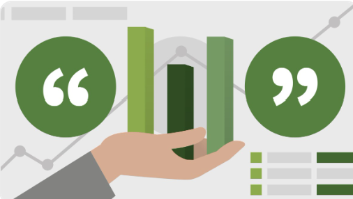
Teaching Productivity Dashboard

Learn about the five teaching productivity metrics featured in the Power BI Teaching Productivity Dashboard—what they mean, how they’re calculated, and why they matter.
WORKSHOPS IN MARCH
MAR 12 – When to Use What: Qualtrics or Microsoft Forms
MAR 17 – Creative Infographics with Everyday Software
MAR 18 – Advanced Qualtrics Survey Workshop
MAR 21 – Truth in Data: Choosing the Right Source
MAR 26 – Teaching Productivity Dashboard
MAR 13 through 26 – Banner Web Time Entry training is available. See the Tech Initiatives site for details.
LINKEDIN LEARNING RECOMMENDATIONS
Data Visualization: storytelling
Learn to turn “facts and figures” into a “story” to create deeper emotional responses in our audience when we present data in story form and fulfill our human expectation for information.
Picking the Right Chart for your Data
This course can help you think more strategically about your data, and provide you with the tools you need to pick the best visual display for the type of data you’re working with—and your ultimate communication goals.
Microsoft Forms Essential Training
Learn to create a basic survey, including how to add different question types—multiple choice, open-ended text, rating, and more—add ranking options, and allow for file uploads.
Have questions or suggestions? Email: itscomm@uncg.edu